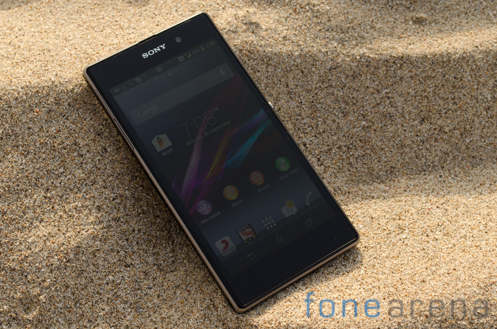
 Sony's mission to combine assets from across the company and to create a flagship device have not gone unnoticed. From the Xperia Z to the Xperia Z Ultra and now the Z1, we've seen a growing consolidation of buzzwords and technology features from across Sony's product portfolio in a bid to create a hero product. The Z and Z Ultra while good products definitely had their fare share of flaws. Will Sony be able to finish what they started and create a device worthy of flagship status? Let's find out. Hardware and Design When you've got a good thing going, you shouldn't mess around with it. We've seen the same with Nokia's Fabula design language and here too, the Z1 looks reminiscent of the Xperia Z. The phone is essentially a glass slab with an aluminum rim around the sides. The glass and aluminum meld into each other to create a design that is positively stunning. The inky blackness further lends credence to the understated but elegant design. Over at the top above the 5 inch screen you'll spot a front facing camera on the right and Sony branding in the middle. Surrounding the screen is a fairly wide and frankly inexplicable bezel. ...
Source: http://www.fonearena.com/blog/83296/sony-xperia-z1-review.html
