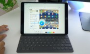
One of the major improvements in iOS 11 that didn't get a mention during the keynote is the updated interface for screenshots. Considering how often we take screenshots these days, it's worth taking a look at all the improvements Apple has included in the new version. For starters, every time you take a screenshot it now goes to the bottom of your screen. It sits there for a while for to interact with it or goes away if you don't. You can also swipe it away manually. If you take multiple screenshots, they all stack there in the corner. You can then tap on it to open up the markup...
Source: http://www.gsmarena.com/check_out_the_new_ios_11_screenshot_interface_in_action-news-25801.php
