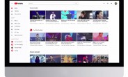
YouTube has announced a lot of updates today. First off, the service has a new logo, combining the wordmark with an icon. The icon is the familiar Play button, which now sits on top of the red outline of a CRT TV that used to be under the "Tube" part of the wordmark. The icon is to the left of the wordmark on the website, but in some cases the brightened up icon will be used as an abbreviated logo. This is rolling out today. The service's mobile apps have been updated with a new design that has the navigation tabs on the bottom (including new Library and Account sections), the ability to...
Source: http://www.gsmarena.com/youtube_gets_a_new_logo_material_design_on_computers_dark_theme_mobile_enhancements_too-news-26991.php
