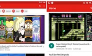
YouTube for Android has received a new design-related update. It's a server-side update that relocates the navigation bar to the bottom of the application. The bar was earlier at the top (the leftmost screenshot in the image below). Not only this, the color scheme has also been reversed - the navigation bar in the updated app has white background with red-colored tab indicators. The order in which the tabs are arranged, however, remains the same. Via
Source: http://www.gsmarena.com/youtube_for_android_gets_a_design_update-news-20406.php
